It turns out that you can remove the IR filter in front of a camera sensor to get some very cool looking images.
This looked far too cool for me not to try, so I modified my old Nikon D3300 to remove the IR filter, and I posted some more photos like this on https://pixelfed.de/p/thezoq2/964148150257886355.
However, this is not at all what the photos look like when they come out of the camera, they require some heavy editing to look this cool, and this post is a brief example of what works for me using darktable. Note that I’m very much a novice user, I just thought i’d write this down to remember for the future, and perhaps inspire someone else.
As Jana explained much better in her blog to get images like these you need a yellow filter in front of your lens. This makes the blue channel IR only, and the red/green channels IR+red/IR+green. In order for the images to get this classic IR look, we need to swap some channels around. Here is what the image looks like with the default darktable modifications applied
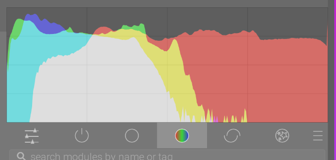
However, with the yellow filter I ended up using 1 at least, the red channel dominates the other colors, something that is quite apparent from the histogram of the image:
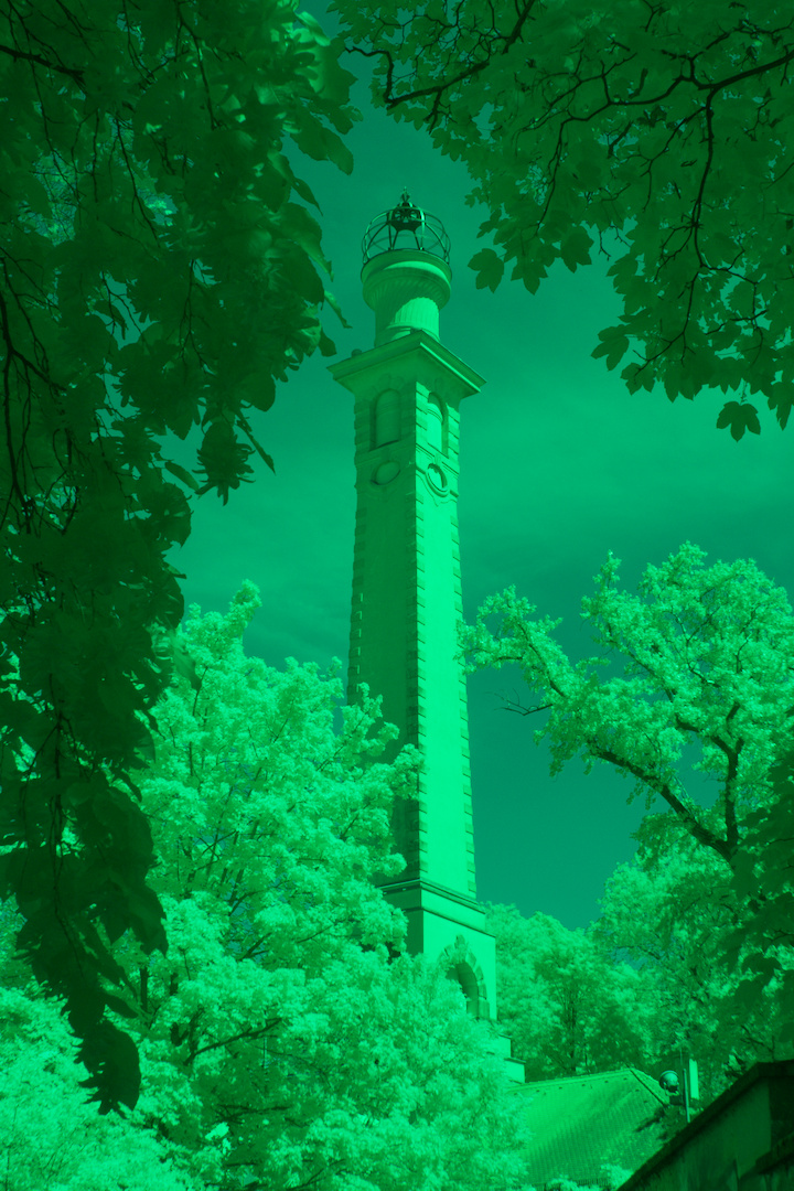
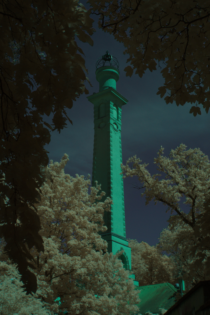
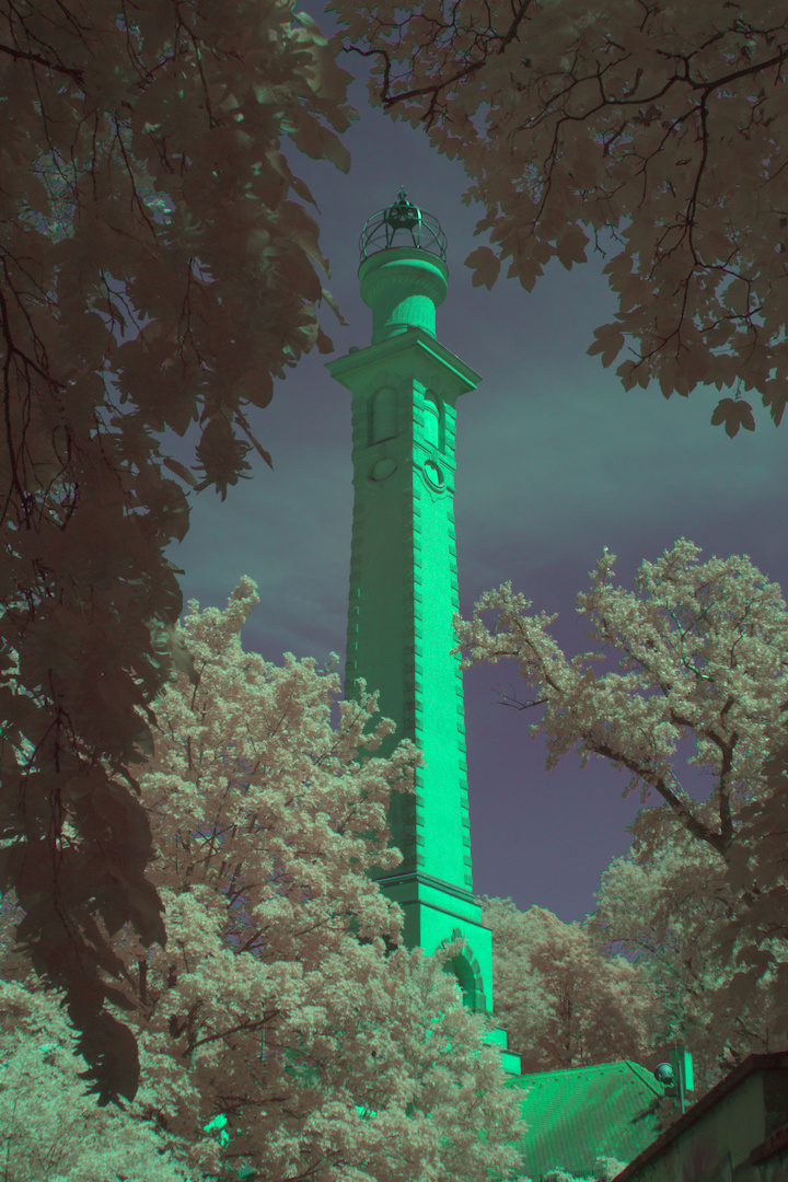
And just swapping the channels as Jana did makes the image very green:
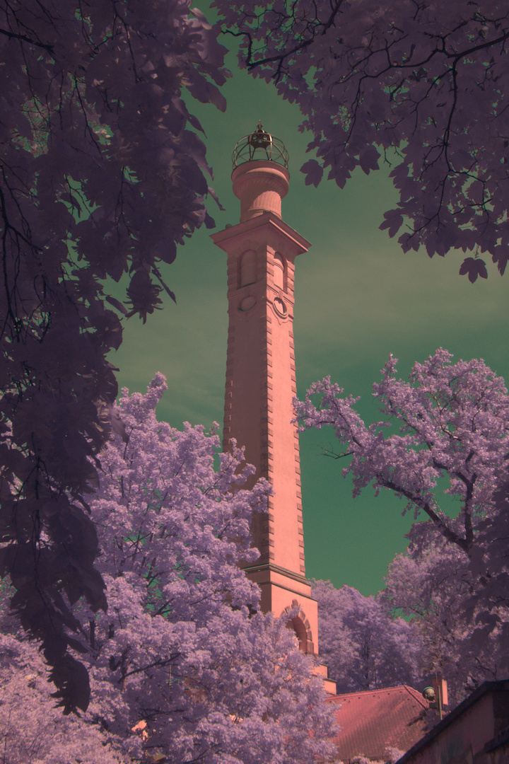
To swap the channels and fix this red bias, I used the darktable Color Calibration module, and set the input for the R channel to be 0.0, 0.0, 1.0, the green channel to be (0.204, 0.0, 0.0) and the blue channel to be (0.0, 0.494, 0.0).
This produces an image that at least has sort of the right hue, but is very dark and doesn’t quite have the colors where I want them
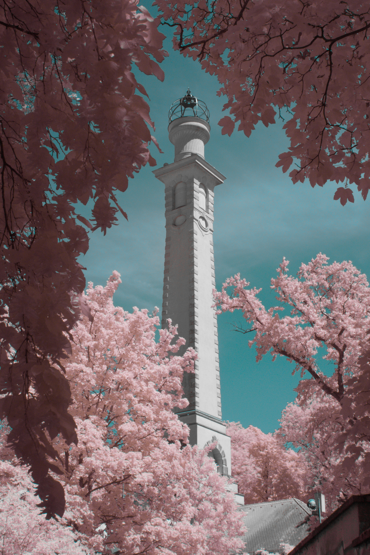
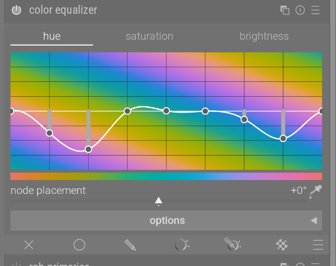
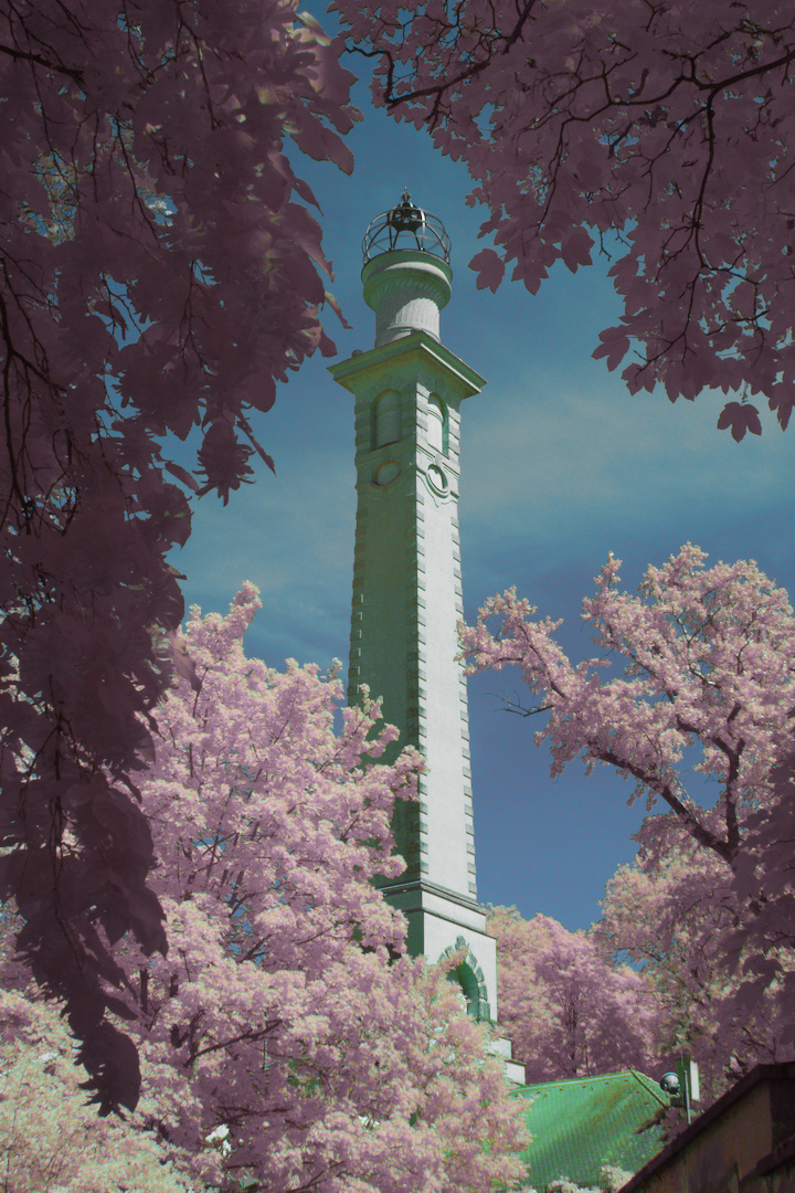
Since this photo was horribly underexposed, I had to increase the exposure, and then we can start doing the fun part: messing with the colors. Out of the box, my color swap makes the sky vaguely blue, and the foliage vaguely orange. IR looks good like that, but for this photo I wanted the pink foliage, so I used the Color Equalizer module to re-map the sky and foliage where I want them:
which gives this result:
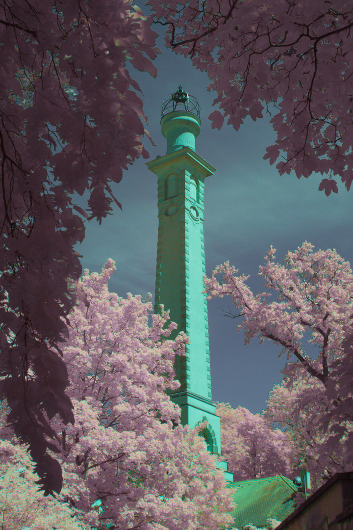
This is satrting to look good, but the sky doesn’t pop as much as I want it, and the tower is aggressively green 2
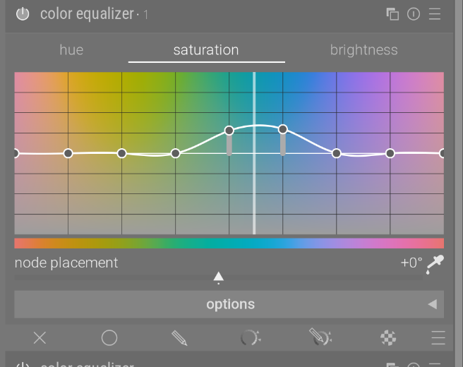
To fix the sky, I used another color map that increases the saturation and brightness of the blue channel:
(Click the duplicate icon at the top right to add multiple instances of the filter, and use the color picker in the bottom right to see which colors to adjust)
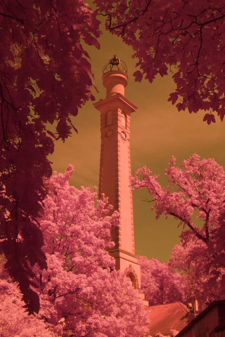
Finally, to get rid of that pesky bright green tower, I used (you guessed it) another color map:
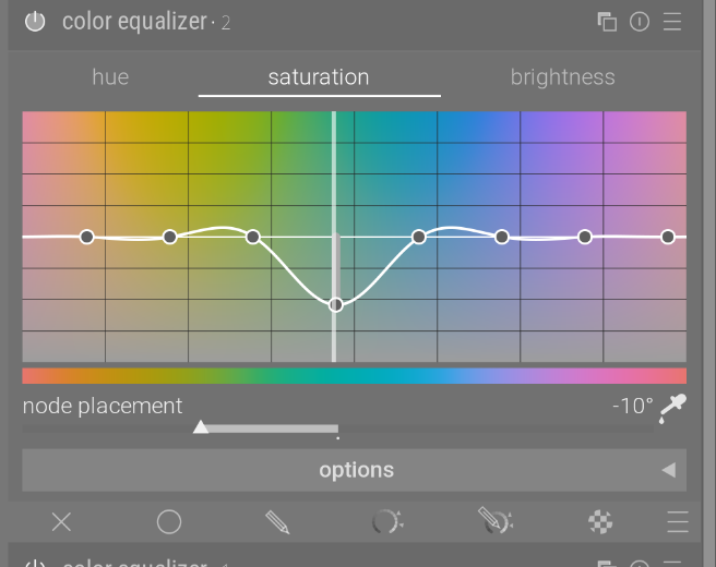
which gives roughly the final result
From here, the usual editing techniques apply as normal.
I saved a preset for the original color transformation and a few different pink/orange foliage setups to quickly be able to edit multiple photos.
This whole R/G/B becoming R+IR/G+IR/IR idea had me wondering, what happens if we use the IR channel to subtract from R and G?
So, changing the Color Calibration coefficients to
(+1, 0, -1) for red(0, +1, -0.432) for green(0, 0, +1.4) for bluewhich gives
Followed by a pure color swap:
(0, 0, 1)(1, 0, 0)(0, 1, 0)gives a result that isn’t as horribly underexposed as the other method but has the same hues. Because we’re not multiplying any channels by 0.2 as before, I predict this will get rid of some noise which I saw with the other technique.
From here, we can do the same color map things I showed before to get presumably similar results, albeit with less noise.