In my last post I wrote about my editing technique for IR photos. Unfortunately, both techniques I wrote about there ended up being quite sensitive to tuning the r/g/b contributions which I didn’t like. This made me come up with yet another technique, which I’ve had more success with.
Let’s start with the image straight out of the camera:
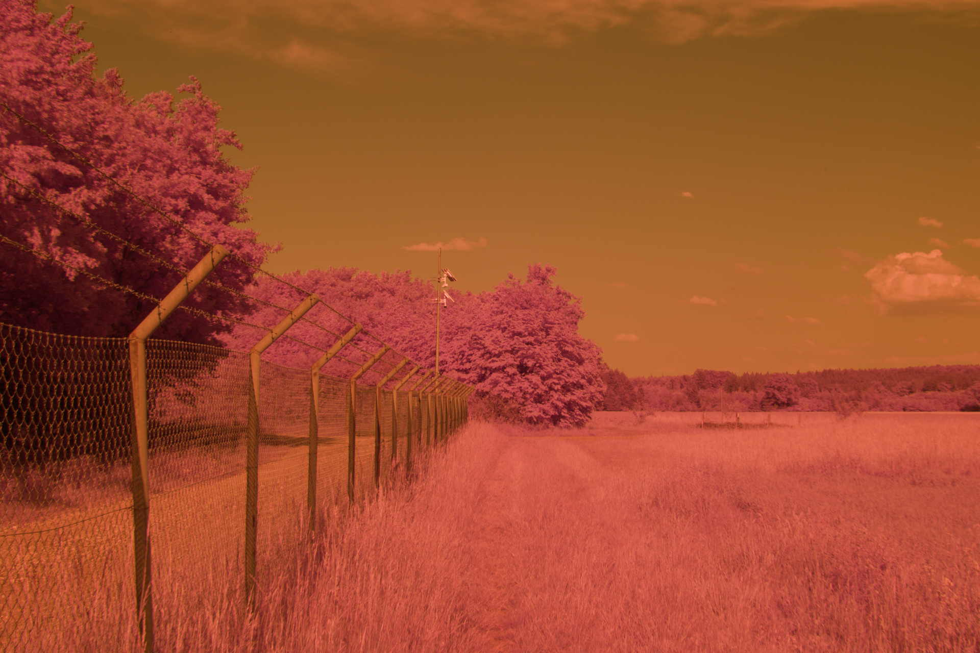
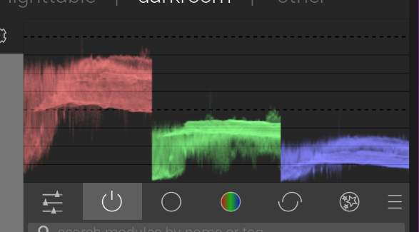
As you can see, it is very red, which just like last time, is also confirmed by the histogram
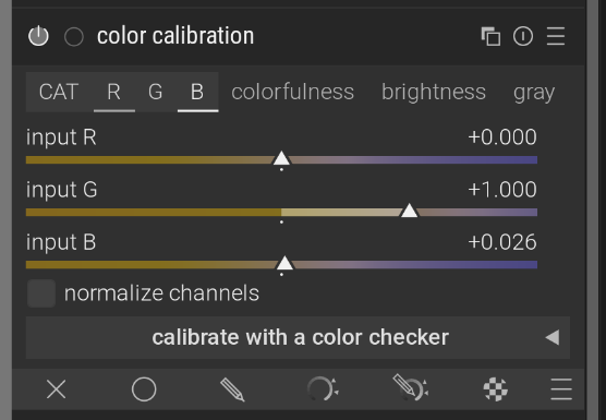
Last time, we tried manually messing with the color channels to normalize this, but a better option is to use white balanace. When you start messing with this, you’ll also get an error in the color calibration module:
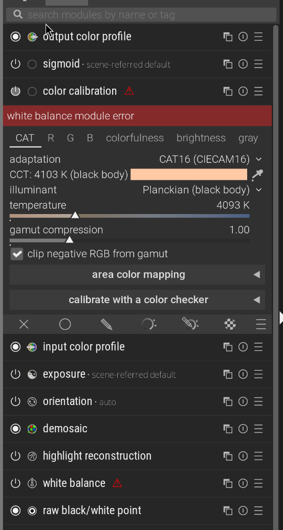
The problem is that darktable normally tries to normalize white balance with the white balance module, then uses this color calibration thingy to do the actual creative white balance. We don’t want this, our colors are all over the place anyway, so in the adaptation setting in color calibration, change it to none (bypass)
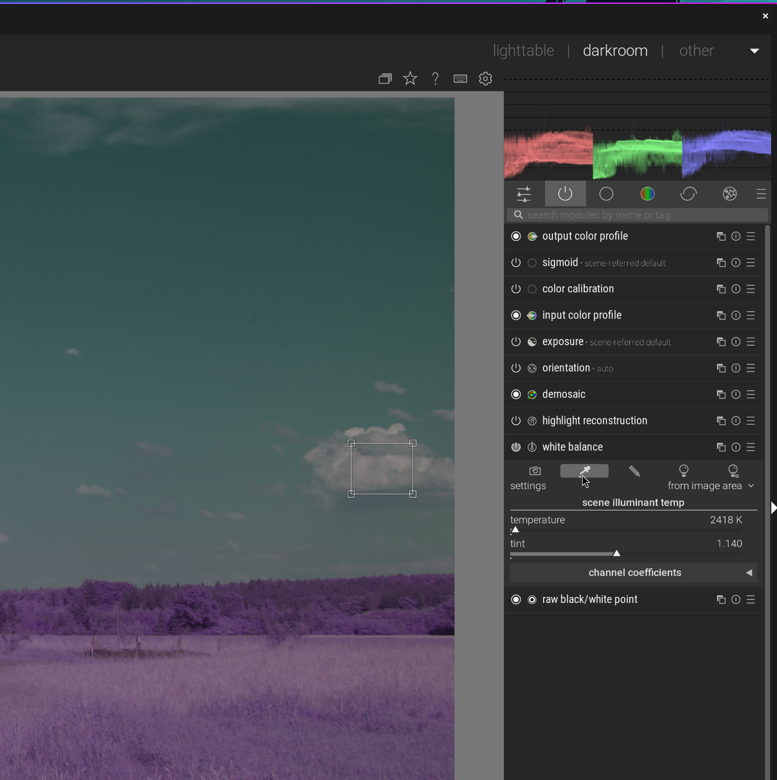
Now, you can start messing with the white balance, and the trick I found here is to try to use the same technique as you would for actual photos, make the gray or white things look gray or white. There are a few techniquest to do this, the most reliable I found is to use the “set white balance from detected area” feature and pick something gray/white like a cloud or a building:
If you don’t have anything gray or white in your image, either use a different image in similar light conditions and re-use that value, or try to adjust it manually, I found that doing it by balancing the histogram works quite well. Whatever method you use, here is roughly what it will look like
This is a very good starting point for more creative editing, in fact, this looks pretty OK even without further editing to me. However, let’s try to get the clasic pink vegetation look. Just like last time, we’ll now permute the r, g, b channels to b, r, g using the color calibration module:
(This module lets you pick the source for each color channel, so to permute to b, r, g set the r source to just b, g to just r and b to just g)
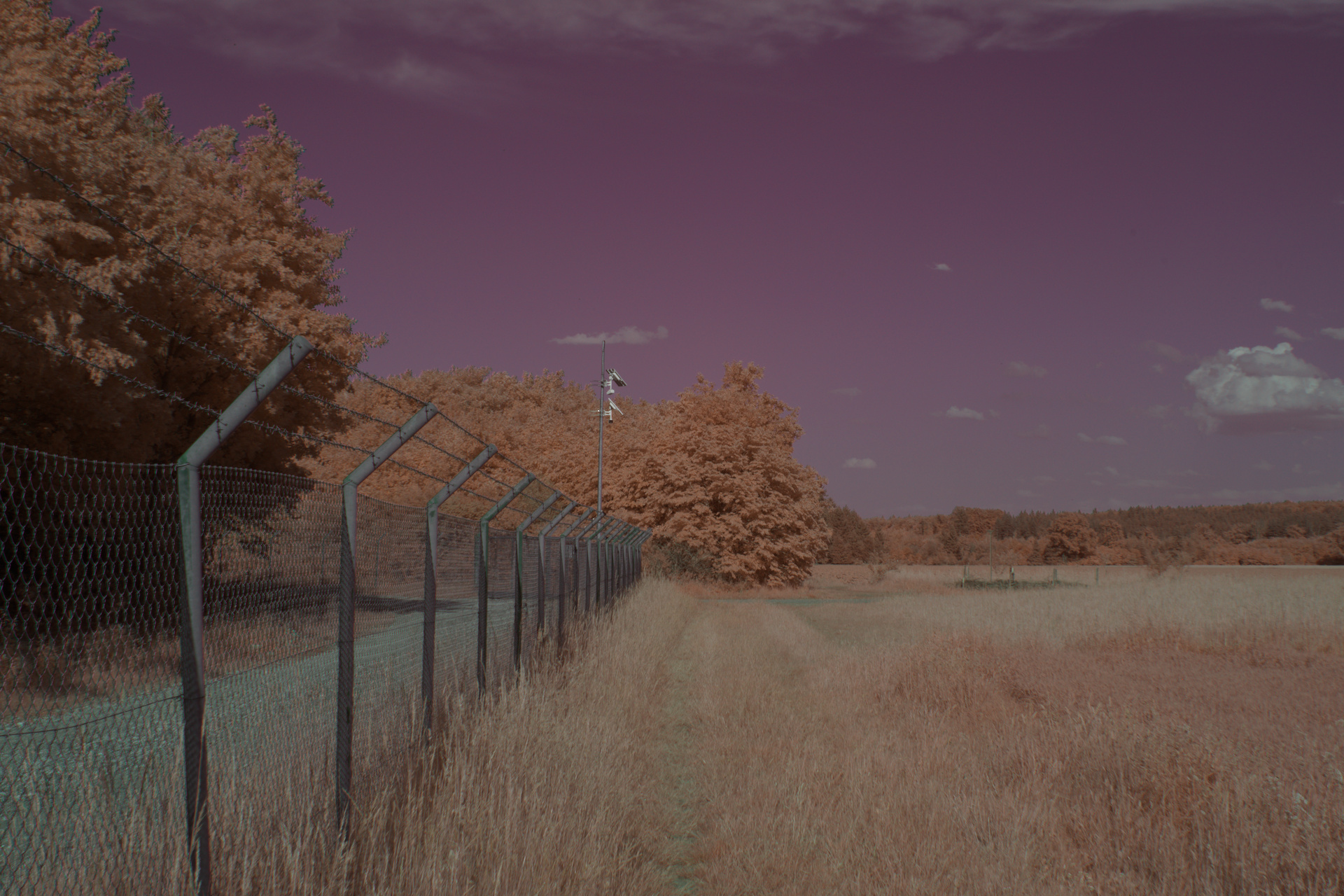
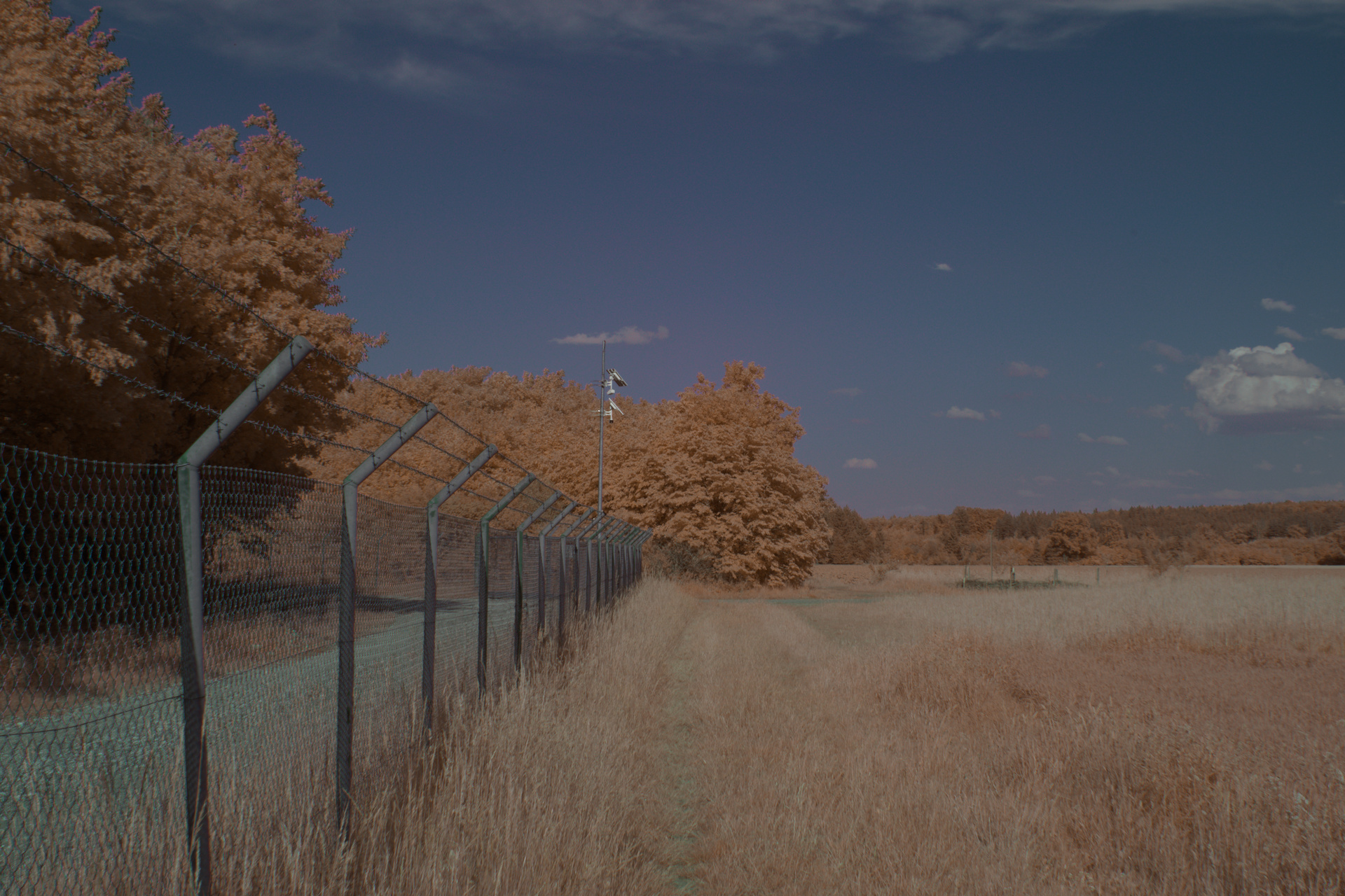
With just this color swap, we have orange vegetation which I think works really well for some shots:
In this case though, the sky being red looks really weird, let’s fix that with the color equalizer module
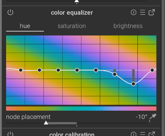
(It is very helpful to use the color picker button in the bottom left to find out exactly which colors to adjust)
With this, our example image looks like this:
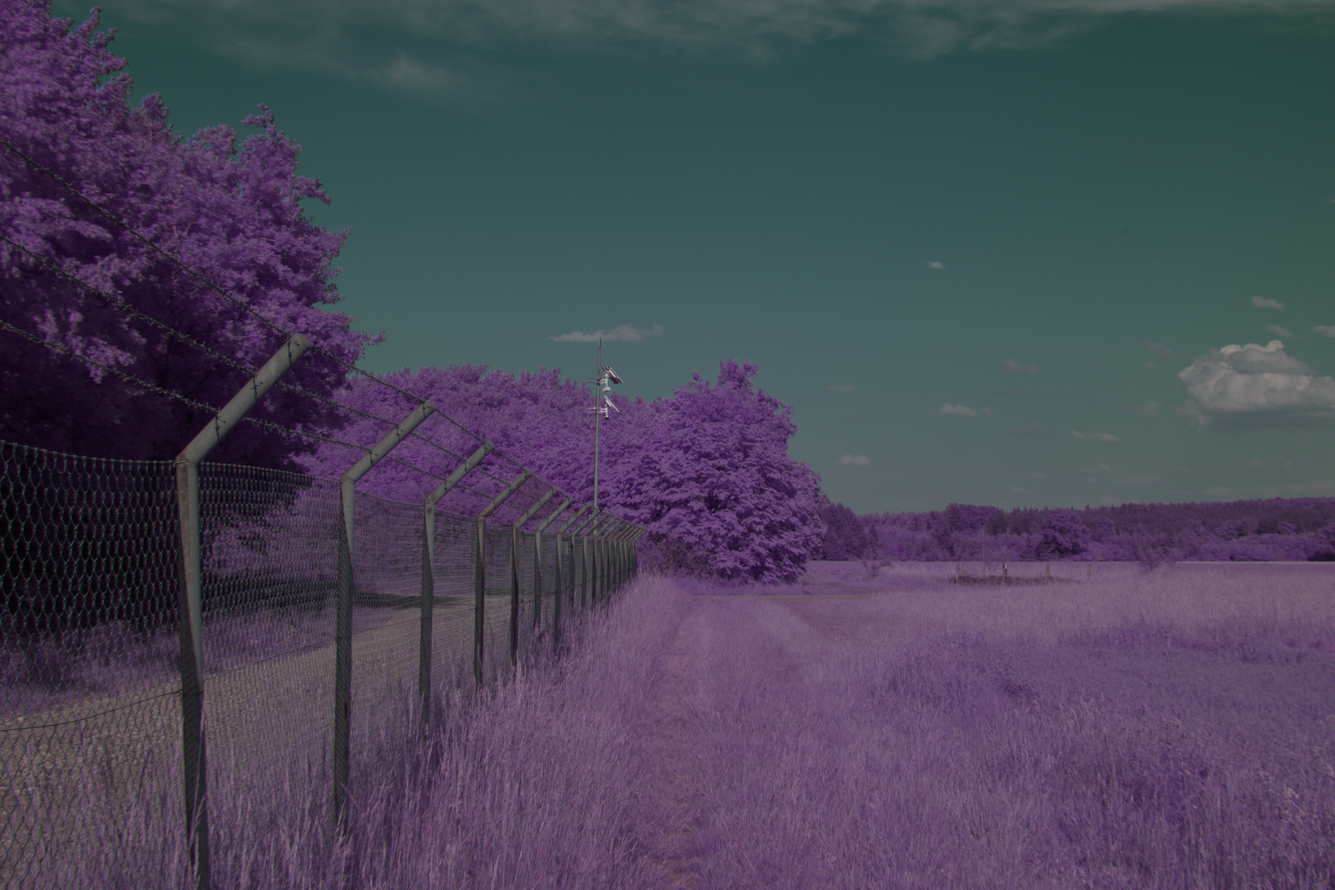
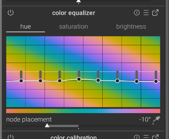
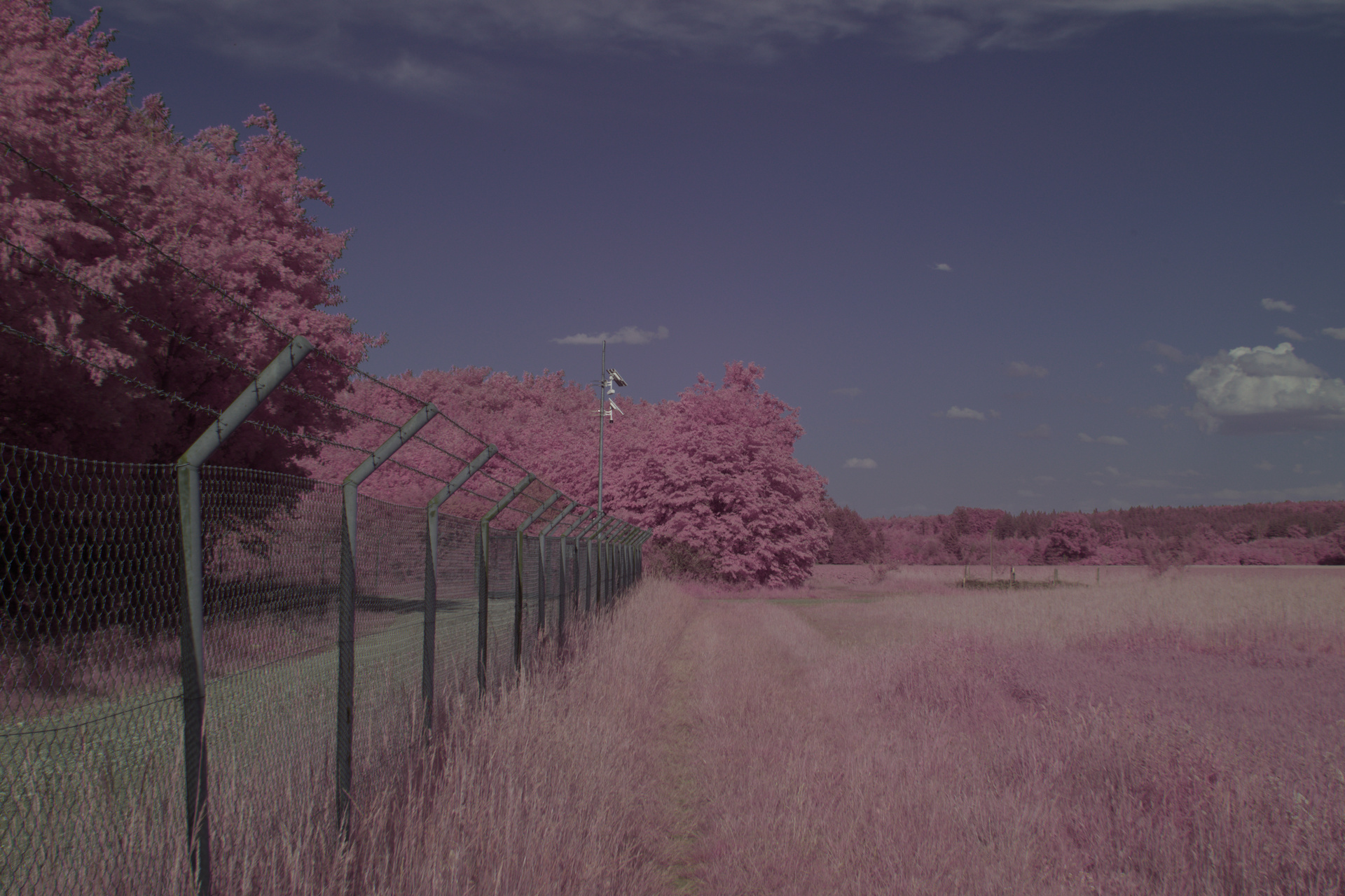
I like this look, but some images look nicer with the pink/purple vegetation which is pretty easy to achieve by just dragging all the colors down with the color equalizer
which finally gives
Just like before, your usual editing tricks apply here. I often end up at leat messing with the saturation and exposure, and if there are some weird looking colors I very often drag those down with the color equalizer. But this varies more per image than these baseline techniques